

Canvas LMS Redesign: Streamlining Student Workflow
- Anaga Anilkumar
- Jul 11, 2025
- 3 min read

Updated: Jul 14, 2025

My Role | User Researcher, UX Designer and Notetaker |
Team | 4 teammates |
Duration | 8 weeks |
Methods Implemented | User Interviews, Observational Interviews, Time on Task, Heuristic Evaluation, Personas, User Journey Mapping, Prototyping, User Testing |
Tools Used | Figma, Google Sheets |
Prototype Link |
Overview
Canvas is the central Learning Management System at Indiana University Indianapolis, yet many students and faculty face friction completing everyday tasks from viewing assignments to managing modules. Our team sought to redesign the Canvas experience to be faster, more intuitive, and aligned with real user needs.
Impact
To evaluate the effectiveness of our redesigned Canvas experience, we tested three common student workflows:
(1) submitting an assignment via the To-do List,
(2) submitting an assignment through the Calendar, and
(3) creating a task or event.
Our high-fidelity prototype led to an average of ~53.5% improvement in task completion time across these workflows compared to the baseline interface.
These results demonstrate the potential for a more intuitive, efficient Canvas interface that directly supports student productivity.
Problem Space
Canvas is Indiana University's primary platform for managing classes, assignments, and communication.
Despite its widespread use by students, faculty, and staff, several usability issues negatively affect the user experience.
User interviews and observations reveal pain points impacting efficiency and satisfaction.
This case study will highlight key usability challenges for students and suggest design improvements to enhance their experience.
Design Process

User Interviews
We conducted interviews with 24 Canvas users (12 students, 4 staff, 8 faculty) to understand common pain points and improvement opportunities.

Insights from the interviews:
Students
Cluttered Dashboard
Inconsistent To-Do & Calendar
Notification Overload
Limited Progress Visibility
Faculty
Inefficient Grading Flows
Complex Assignment & Module Setup
Media & Content Duplication Issues
Staff
Cumbersome Course Management
Weak In-App Support
Poor File Handling
Integration Gaps
User Persona
As a group, we've created three personas based on the data gathered from user interviews.


We focused on the student perspective to simplify daily interactions with Canvas, prioritizing two key workflows:
Accessing and submitting assignments via the To-Do list and Calendar.
By streamlining this workflow, we aimed to centralize assignment visibility and submission in one place, making it faster and clearer for students to stay organized.
Messaging from the Groups section while improving the inbox flow.
This aimed to enable direct communication from Groups and reduce friction in checking and sending messages, supporting smoother collaboration within courses.
User Journey Map
We mapped the emotions and pain points students experience during the assignment submission process on Canvas, specifically when accessing assignments through the To-Do list and Calendar. We also examined how students felt while adding events or tasks to the Calendar to test ease of use and clarity within this workflow.


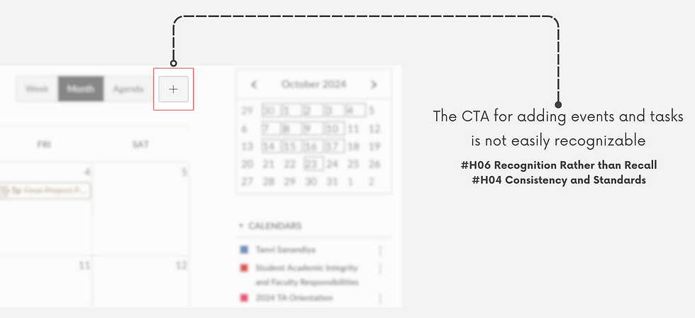
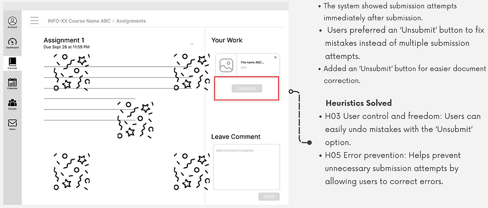
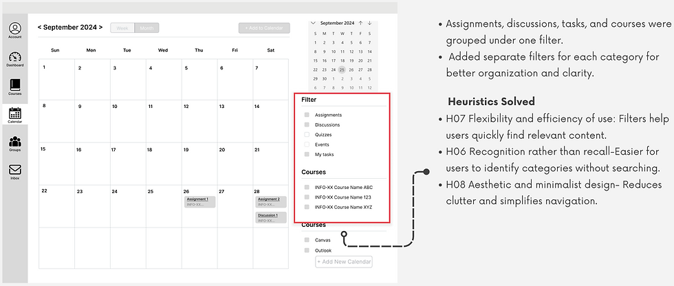
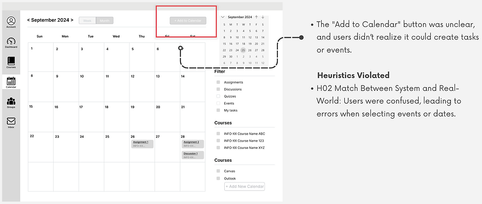
Heuristic Evaluation
Using Jakob Nielsen’s 10 Usability Heuristics, we evaluated the assignment submission and calendar event workflows in Canvas and identified key UX issues:


Low-Fidelity Wireframe Designs based on User Interview Insights


Findings from Low-Fidelity Testing
The "Add to Calendar" button was unclear, and users didn’t realise it could create tasks or events. To address this, we changed the text to "Add Event/Task" in the mid-fidelity design for better clarity and understanding.
Insights from Mid-Fidelity Wireframe Testing


Insights from High-Fidelity Wireframe Testing


Key Performance Indicators
KPI's that we tracked for the 2 workflows are as follows:

Baseline v/s Final Metrics
Through iterative testing and design refinement, we significantly reduced task completion rates and clicks while improving accuracy across all workflows, demonstrating clear, measurable impact.


Impact

Team Learnings
Improved teamwork: Better at sharing ideas and turning them into actions.
User studies: Gained insights into conducting respectful, consent-driven research in natural environments.
Effective questioning: Learned to ask probing questions for deeper interview insights.
Testing limitation: Canvas loading times affected task durations, unlike the Figma prototype, causing inflated time measurements.
Usability improvements: Clear improvements seen through metrics and positive feedback from high-fidelity testing.
Initial vs. final metrics
Positive user feedback from high-fidelity testing.


Comments