

Markid: How Research Revived a Platform
- Anaga Anilkumar
- Jul 5, 2025
- 4 min read

Updated: Oct 1, 2025

My Role | UX Researcher, UX Designer and UX Strategic Consultant |
Team | Me (UX Researcher, UX Designer) Shaijin (Design Lead, POC for the client) Ankur Dhawan (Client, Product Owner) |
Duration | 2 months |
Tools Used | UserTesting.com, Google Sheets, Zoom, Figma |
Methods Implemented | Usability Testing, Heuristic Evaluation, Competitive Analysis, Stakeholder Interviews |
Prototype Link |
Overview
The client initially requested a full web app revamp without much context. After conversations with the development team, our design team learned that declining sales and low engagement were likely driving this request.
I took the initiative to reframe the vague redesign request into a research-first process. Through an independent study, I secured stakeholder buy-in and guided the team in conducting user research, which ultimately led to a data-driven checkout flow redesign.
The result? A 40% sales increase in Q1 post-launch, lower cart abandonment, and more intuitive navigation that boosted engagement.
Problem Space
Despite declining sales for over a year, stakeholders assumed the problem was purely visual and pushed for a redesign. They were hesitant to invest in UX research, and with limited time and resources, there was a risk of committing to costly changes based on assumptions rather than real user needs.
The Solution
reframed the project into a research-driven process that prioritized uncovering root causes before design changes. By conducting an independent study, I secured stakeholder buy-in and built a case for deeper research.
This case study is divided into two parts:
🔹 Securing Buy-in for Research
🔹 Redesign Based on Actionable Insights

Final UI


Section 1
Securing Buy-in for Research
The Challenge
My primary challenge was to prove, with limited time and budget, that research could uncover the true causes of sales decline.
My Approach: Advocating for Users
I chose to investigate the real issues first using two quick, low-cost methods: Heuristic Evaluation and Competitive Analysis, rather than diving straight into a revamp.

Heuristic Evaluation
I started with a Heuristic Evaluation because it was quick, inexpensive, and gave me a high-level view of the app’s usability issues.
One major finding was the unclear checkout flow, which I suspected might directly impact sales.


Competitive Analysis:
To validate this suspicion and bring in the user’s perspective, I conducted an experience-wide competitive analysis where three parents navigated both Markid and competitor apps, completing tasks like:
🛒 Adding a product to the cart and checking out
🔍 Browsing product details
💬 Messaging a seller
I observed how they navigated these flows, noting both the positives and the pain points.

Key Finding
Both methods confirmed that the checkout flow was the most critical pain point, and likely a major reason for declining sales.
Why these methods?
I employed quick, low-cost methods, first identifying flaws and then validating them with users to build a strong case for deeper user research.
Outcome: Secured Stakeholder Buy-in
By framing usability gaps as revenue risks, I shifted stakeholder perspective. Despite initial skepticism, they agreed to invest in usability testing and user interviews.
I presented findings in business terms rather than UX jargon. For example:
The checkout has four steps, but users can’t tell where they are in the process. A busy parent is likely to abandon their cart directly into lost customers and declining sales
Section 2
Kickstarting Research with the Team
Problem Statement
We needed to validate our hypothesis that checkout issues were negatively impacting sales and uncover other factors affecting Markid’s revenue.
Research Questions
What are the main challenges users face on the Markid platform?
What factors are contributing to low sales on the platform?
Can users easily find key product details and other important information on the app?
How do users perceive and navigate the checkout process on Markid?
Research & Business Goals

The Process

Usability Testing
Given our limited time and budget, we conducted think-aloud usability testing via UserTesting.com to assess the user journey.
Participant Criteria
We tested with 7 participants, ensuring diversity:
2 first-time parents
2 same-sex couples
3 experienced parents
Metrics Tracked
Number of clicks to complete key tasks.
Number of scrolls required to find product details.


Key Insights
Users failed to recognize that Markid was a re-commerce platform.
Users struggled with checkout, losing trust due to inconsistent UI and unclear steps.
The homepage contained too much information, overwhelming users.
User Interviews
Usability testing revealed what users struggled with. To uncover the reasons behind these struggles, we conducted follow-up user interviews with 4 participants.

Key Finding
These interviews confirmed that confusion around the buyer–seller model and checkout flow directly eroded user trust making a redesign urgent and business-critical.
Why These Methods?
We combined usability testing and user interviews to capture both what users struggled with and why they struggled. Together, they gave us actionable insights that went beyond assumptions and directly tied usability gaps to user needs.
Converting Research Insights to Design Directions using HMW Statements
We translated recurring user pain points into "How Might We" (HMW) statements. An example is shown below:
❓ HMW make it clear that Markid is a re-commerce platform?
💡 Added homepage banners stating “Pre-Loved Baby Items” for clarity

Paper Wireframes
Insights from usability testing, user interviews, and HMW statements directly informed our early sketches. I focused on streamlining the checkout flow, the most critical pain point.

Final UI Designs
Building on the validated wireframes, I collaborated with my design team lead and UI designer to translate insights into polished solutions.


Key improvements included:
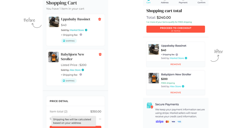
Progress Bar – Displayed checkout steps to reduce uncertainty
Early Shipping Cost Calculation – Collected address in Step 2 to show charges upfront
More Payment Options – Added Apple Pay, Google Pay, and GrabPay
Accessible Cart Controls – Made the “Remove” button easy to locate
What I'd do differently
Here’s how I’d approach the project if I did it again

Key Takeaways & Learnings
A few impactful things I've learnt


Comments