

Improving IU Library's Map Usability
- Anaga Anilkumar
- Jul 8, 2025
- 3 min read

Updated: Jul 30, 2025

My Role | User Researcher, Notetaker |
Team | 4 teammates |
Duration | 6 weeks |
Tools Used | Google Sheets, Figma |
Overview
The Indiana University Library website provides digital maps to help students navigate the library, but low awareness, poor mobile usability, and overwhelming design made them ineffective. Through usability testing, field observations, and user interviews, we identified key pain points and recommended an interactive, intuitive, and accessible redesign to improve wayfinding.
This case study details:
Diagnosing the Problem – Understanding why students struggled to use the library maps.
User Research & Key Findings – Conducting usability testing, observations, and interviews.
Proposed Solutions & Impact – Design recommendations to enhance usability and navigation.
The Challenge
The University Library Website Design Team had received feedback that students struggled to locate books and study spaces using the library’s digital maps.
Gary R. Maixner III, UX Management Librarian, wanted to improve map discoverability and usability but lacked data on where users were struggling.
The maps needed to support both pre-visit planning and real-time navigation inside the library.
Our goal was to validate these concerns with user research and recommend design improvements
Research Questions
Some of the research questions that me and my team addressed are as follows:
What are the navigation challenges users face when using Library Maps?
How intuitive and accessible is the current interface for first-time users?
What features are users looking for in a library navigation tool?
How do users prefer to receive spatial guidance? (e.g.,visual cues, text directions, interactive maps)
In what ways could Library Maps integrate with other library resources for a seamless experience?
Research Goals


Research Methodologies Implemented
Given the need for real user insights, we conducted:
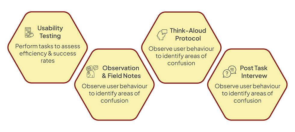
Our Approach:
1. Designing the experiment
The research began with defining clear objectives: to evaluate how effectively users could locate and navigate library maps and identify friction points. A task-based usability test was designed to simulate real-world scenarios, focusing on:
Testing users’ ability to locate the map feature.
Observing how users navigate to specific locations using the map.
2. Conducting Interviews
10 students were recruited via university bulletin boards and email lists.
A Think-Aloud Protocol was used to capture participants’ thought processes while completing tasks. Observers recorded qualitative insights and task success rates.
3. Evaluating Data
The final step involved analyzing data to identify trends and usability challenges:
Task success rates were calculated to measure ease of use.
SUS scores provided a quantitative measure of overall usability.
Observational notes from think-aloud sessions highlighted user frustrations and preferences.
Usability Testing
The Age Group of participants was 19-29 years

Key Performance Indicators (KPIs)
Task Success Rate
Participants were tasked with locating and using the library map to navigate various sections of the library. Only 20% of participants successfully located the library map without assistance, revealing significant challenges in discoverability.

While 100% of participants eventually completed navigation tasks like finding study rooms or the Service Desk, many struggled with the usability of the map, showcasing moments of frustration. This indicates that even though participants managed to complete tasks, the process was neither smooth nor intuitive.

System Usability Scale (SUS)
The Library Map website received an average SUS score of 58.5, which falls significantly below the benchmark of 70, pointing to poor usability.

Qualitative Usability Metrics
📍Landmark Effectiveness

Visual landmarks such as elevators and staircases were effective in aiding orientation, receiving positive feedback from participants. However, reliance on these suggests a need for additional intuitive cues within the map design.
🧭 Navigation Inefficiency

While users completed navigation tasks, they faced significant challenges interacting with the map. Key issues included overwhelming visual design, unclear labels, and frustrating functionality, particularly on mobile devices.
Key Findings

Lack of Awareness
Many users were unaware of the map feature.
Difficulty locating the map on the library website and app.
Particularly, new users struggled to find it.

Challenges on Mobile Devices
The small screen size made the map harder to use.
Difficulty with zooming, text readability, and navigation on mobile.
Mobile experience was cumbersome compared to desktop.

Confusing Map Design
Users found the map design overwhelming.
Dense information and unclear visual cues.
Color coding and room labels were not intuitive.
Design Recommendations


Projected Impact
Implementing these recommendations will:
Boost User Confidence & Satisfaction – A more intuitive interface enhances trust and ease of navigation.
Improve Efficiency – Users will find resources faster, reducing frustration.
Increase Task Success by 50% – More users will successfully locate the library map.
Raise SUS Score Above 70 – A significant improvement in overall usability.


Comments